Supermarket
UI DESIGN
SYSTEM DESIGN
We teamed up with our partners Supermarket on their studio brand tool and website design in a low-fi and collaborative way.
Partners
Supermarket
Collaborators
-
Tech
Gatsby
This collaborative approach allowed us to co-design solutions in code as opposed to having all the answers in Figma files and served as a field test for processes we can implement in client work. Supermarkets brief: “Let’s see what the code wants to do”

Brand Discovery
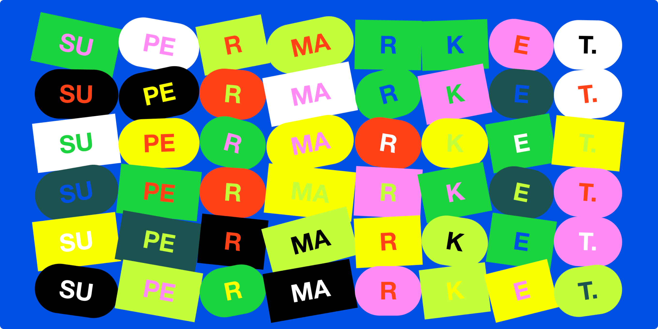
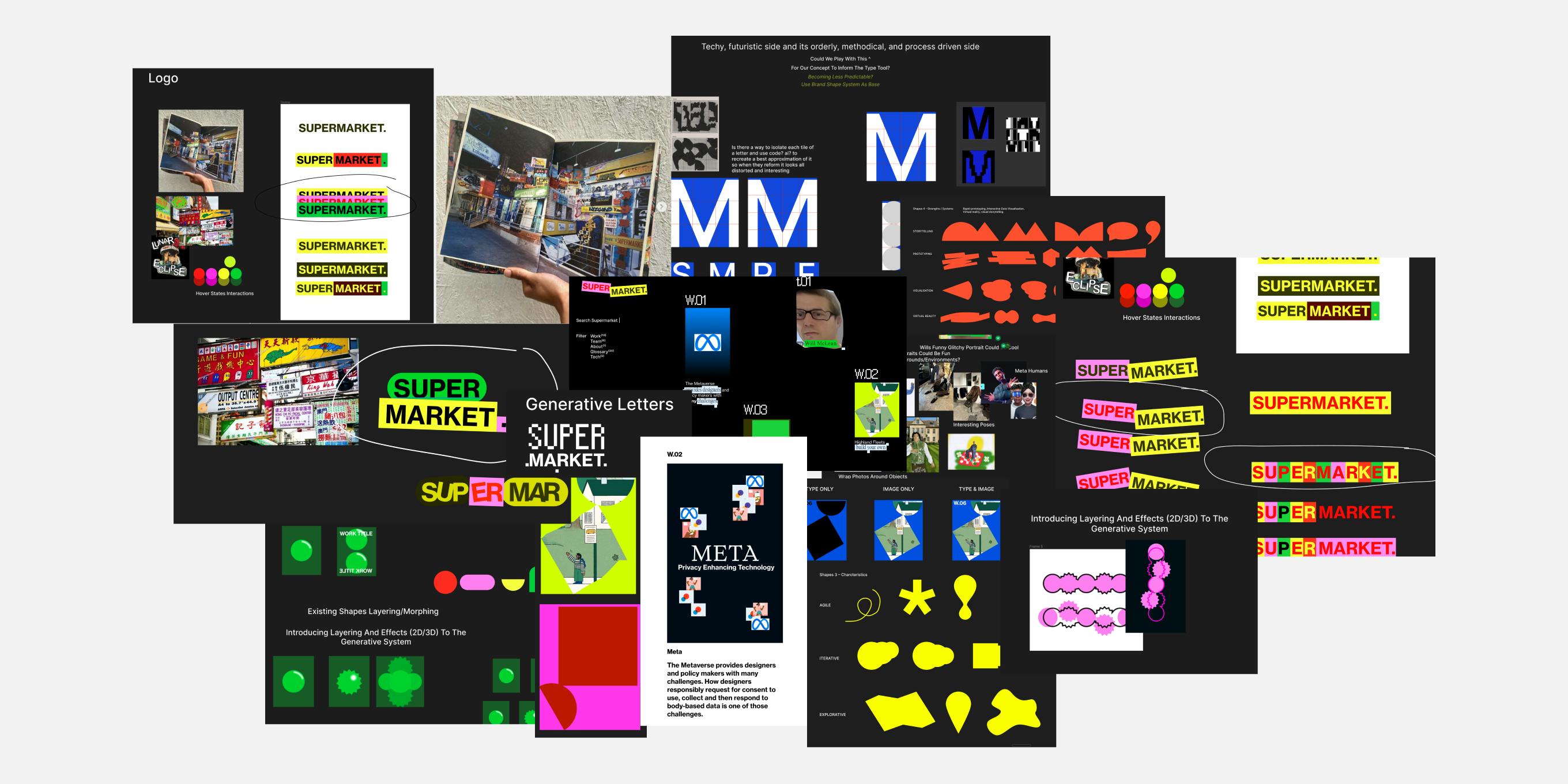
The layering and interaction of shapes, colour and type in typical market signage from around the world helped inform the visual system. Influential references included the ‘Street Market’ show from the Venice Biennale by Barry McGee, Stephen Powers and Todd James where this visual layering was explored in the physical space.

Logo Tool Research
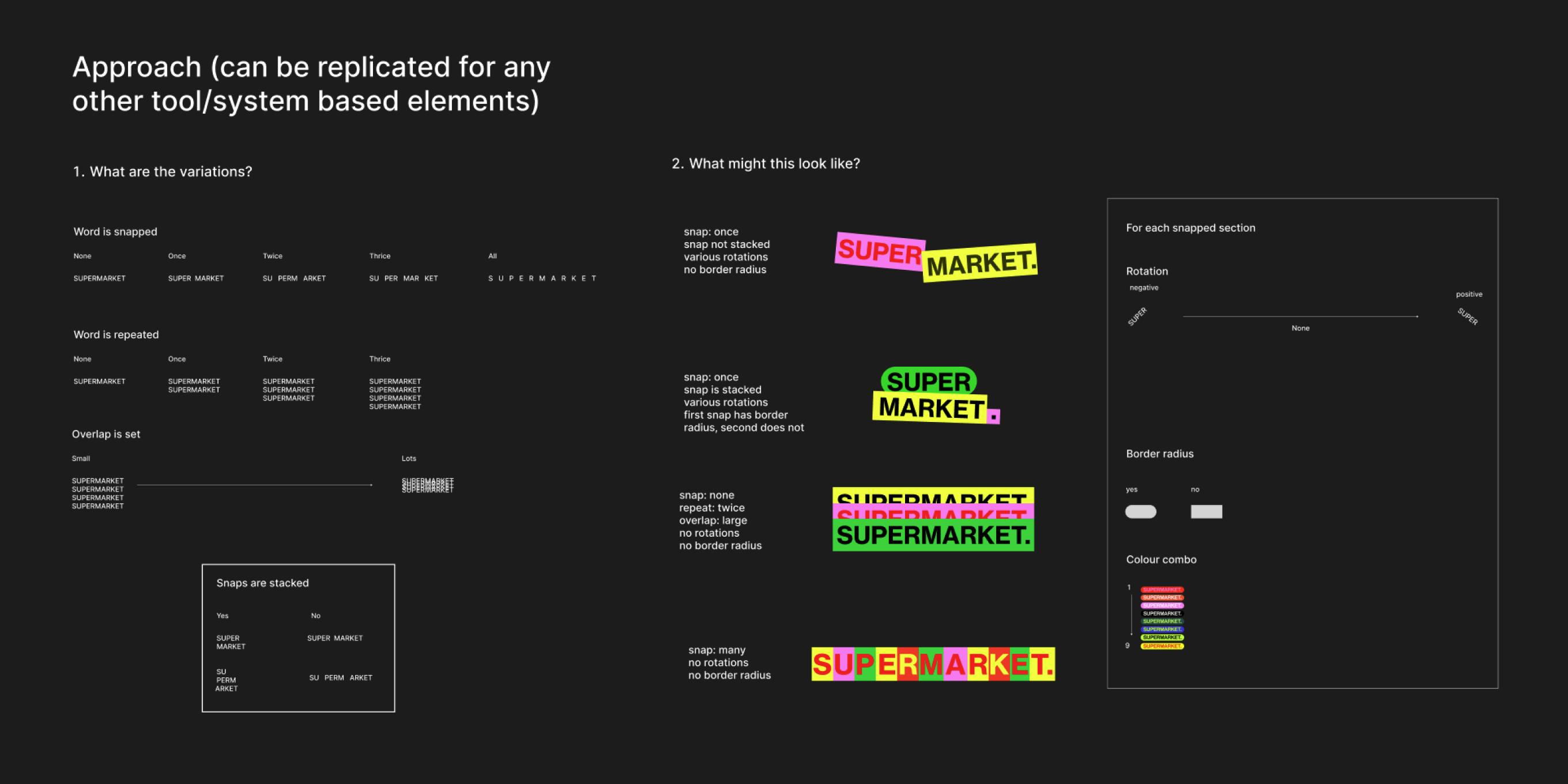
Inspired by Dr. Martin Lorenz’s manual ‘Flexible Design Systems’ we started to think about how the logo tool could work and look by sketching out a brief which was used to build the prototype.

Logo Tool In-Browser
A paired back and functional UI for the logo tool, with controls added during the prototype process. Exciting to see this as a potential tool for client work, allowing internal teams to create brand assets and systems. Future states include iteration saving and file exporting.
Website Process
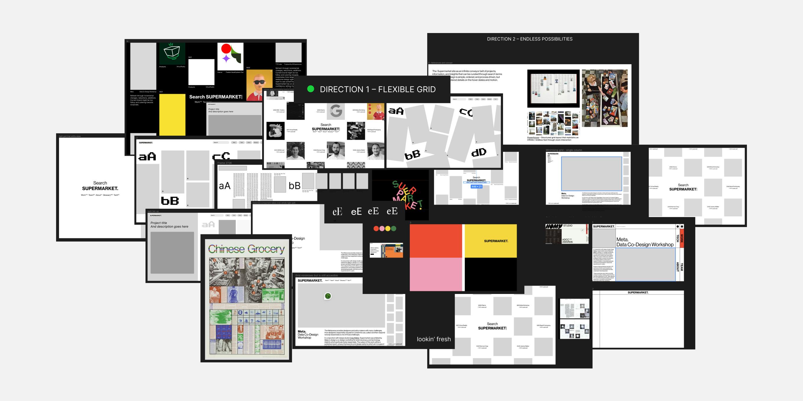
We began by exploring visual references for Supermarket’s website and conceptual thinking. A wonderful wireframe brief came through from Will with the idea of displaying the content of the site in a searchable index powered by Algolia - creating an interactive user experience that encouraged exploration. We started to remix the wireframes with different ideas.

UI and Development
Supermarket prototyped the searchable content index to validate the concept. Allowing us to make UI decisions in parallel with the build. Future states include being able to save pieces of content with the ability to export as a PDF to share, referencing the supermarket selection process.